In case you missed it, I recently reviewed Alison Dupernex’s Creative Machine Knitting.
And boy can I say I was excited but also nervous when I noticed she replied to my Instagram post about the review.
…I threw all my designs in and my ‘colour madness’ to encourage and inspire knitters to go and make for themselves.
Alison Dupernex
Click on the post to view the entire comment.
Her color stories are sometimes very “out there” to me, as in “there’s no way I’d personally choose that,” but her comment on my review got me thinking.
I decided to pick up Designing with Colour, another book Dupernex wrote in 2020. (I’ll fully review that one soon, but it’s another nice one).
Somehow her color choices didn’t feel as wild to me as they did in Creative Machine Knitting, the most recently published one, but Dupernex’s design theory and point of view remain consistent.
I’ve changed.
I started to ruminate on how I use color in my own work.
My default want is to add texture. And there’s nothing wrong with that. Texture is lovely. But I ran into the thought
… am I afraid of color work?
I adore hand dyed yarns from indie dyers. I love to let the yarn do the work for me color-wise. I like to see how the colors pool, stripe, or blend together. I know what I’m working with, but I don’t know exactly how the garment will turn out, and each skein is unique.
Does letting the yarn do the work for me make me a lazy knitter? I don’t think so.
Does that make me a lazy designer? Not necessarily…
But I think it does make me a bit complacent.
It’s easy to rely on beautiful hand dyes to catch eyes and bring people to your work.
It’s not at all a bad thing to use the gorgeous colors others have curated in your work.
But I’m not really growing or building skills as a knitter or designer that way.
Starting Out Small
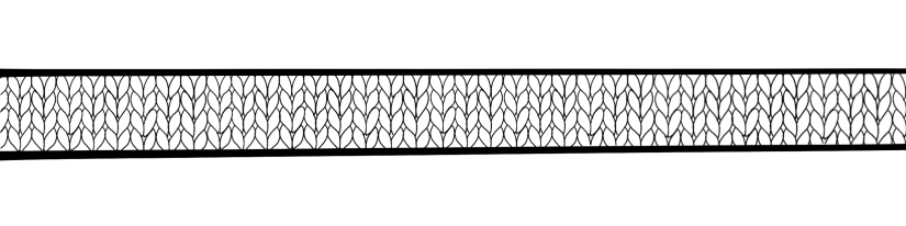
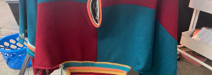
I initially felt drawn to Dupernex’s color blocked designs the most. I decided to start with her Blocked Sweater from Creative Machine Knitting that featured textured striping on the sleeves and borders of the garment since texture is my favorite thing in knitting.
The design features nine colors.
Until recently, I didn’t even own nine colors in the same yarn. I think six is my maximum, and that’s if you count Silk City Fibers Cotton Bamboo and Lion Brand CoBoo as the same yarn in different put-ups.
I found some new old stock vintage Millor Trenzado Industrial cone yarn through a Facebook post (read some tips on finding cone yarn in this post), so I finally have enough colors in the same weight of yarn to experiment.
After looking through the cones, I had no clue where to start choosing colors. I googled “color palettes” and ended up at Coolers.co narrowing down their existing color palettes to those with nine colors. From there, I tried to see which ones 1) I liked and 2) actually existed in my new cone stash.
I landed me with this one. I took a screenshot, but I’ve been unable to locate it again. I’ll update with a direct link if I find it.
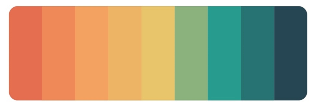
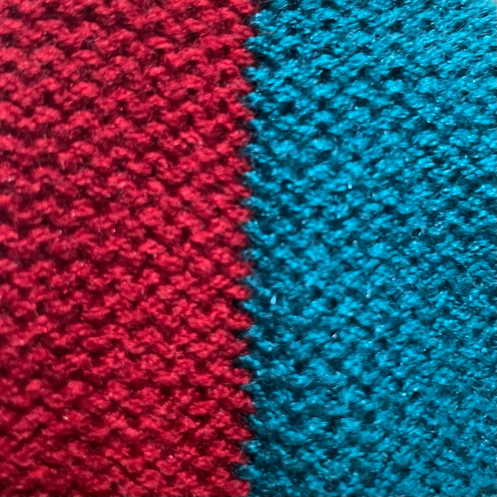
This palette gives me a southwestern US vibe, and I like that. Holding vacation thoughts in my head, I matched the colors as best as I could from the existing pile and buckled down to knit.
Actually Knitting
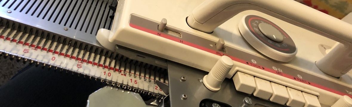
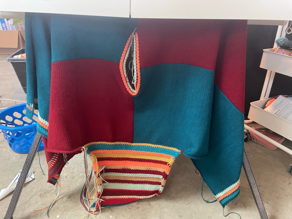
Trenzado Industrial is probably a little bit large for this project, but I decided to continue with the fabric at the pattern’s prescribed tension because it knit well on my Brother KH890 and blocked out nicely.
After knitting the back right, I quickly realized I needed to dig out a color changer so I could avoid having to get up every few rows to change colors. Just a note: If you decide to get a color changer, there is a difference in models for Brother machines at least, and some will not work with the ribber bed attached while others will.
The garment itself wasn’t difficult to knit, but I made it a bit harder on myself by reversing the shaping on one front while I was listening to a podcast.
I didn’t realize until I went to pin the piece onto my dress form, so I had to rehang the stitches and unravel a few inches so I could fix the neck and shoulders. It wasn’t a big deal, but I felt a bit silly.
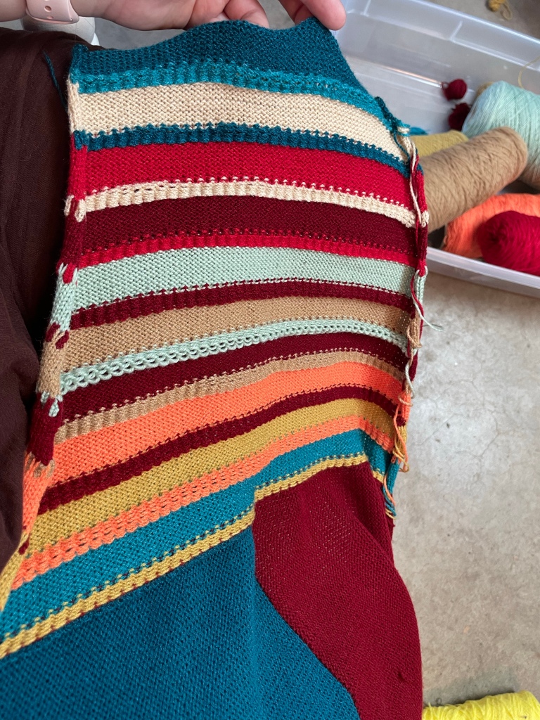

I’ve always admitted to being a lazy knitter, so I didn’t enjoy knitting the sleeves. Changing yarns so often was annoying, and I didn’t feel like I could get in the groove with so many quick sections and color changes alongside the decreases. That’s on me, but it is harder to knit something when you don’t enjoy the process.
I do like the overall color palette that the coolers app presented, but in addition to being a lazy knitter by nature, I think I must be a second-guesser, especially since I opted for some tans instead of oranges due to supply.
I questioned my color choices the entire time I was knitting. Is this orange too bright for the southwest feel? Why did I think this needed a green? That’s too minty, why did I think it was a light sage?
I had to keep telling myself to trust the process.
Trust the process. Trust the process…

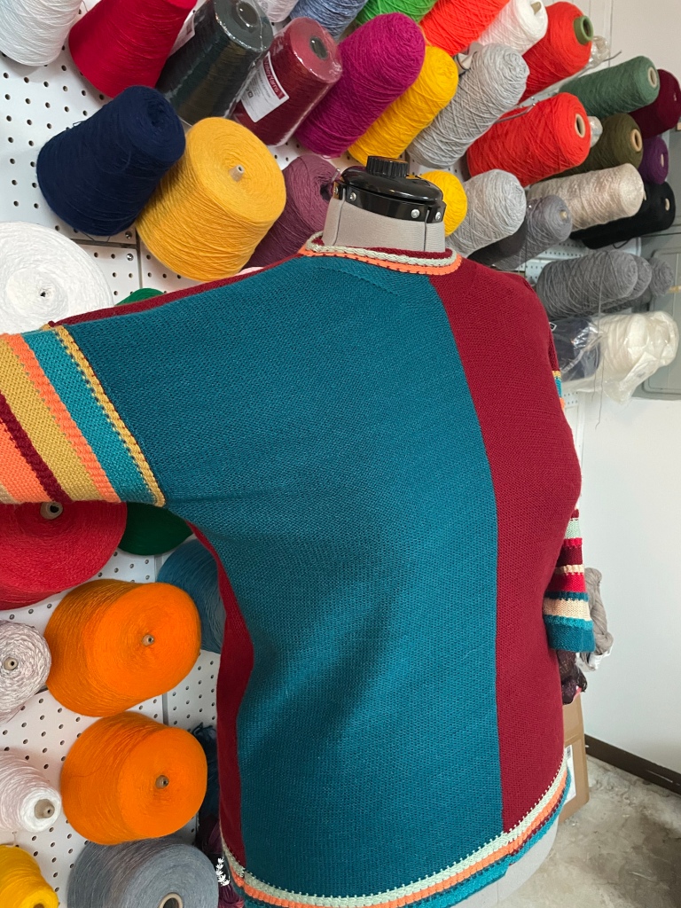
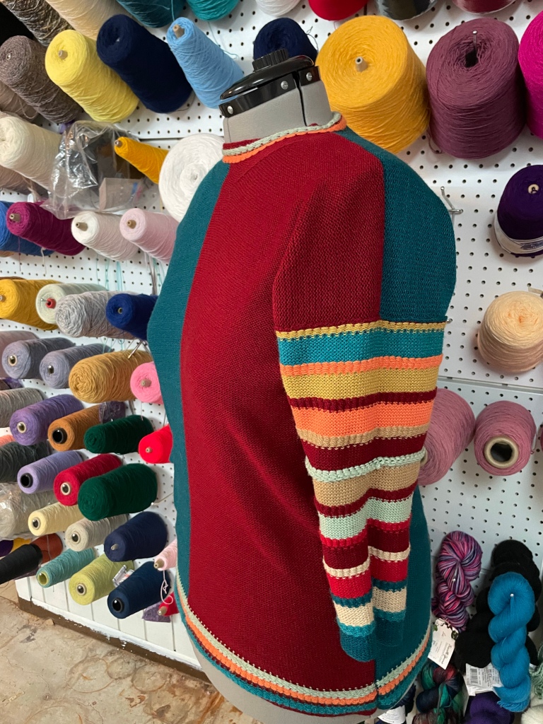
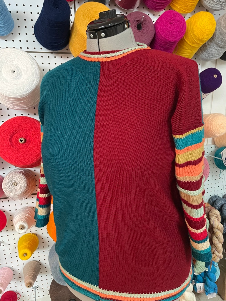
What do you think?
It looks pretty okay, right? I’ve been telling myself, “Look here, overthinking second-guesser. It turned out great and now you have a color palette ready for the next one!”
But let me overthink some more…
Since I already liked color blocked items, just doing one with striped sleeves and calling it a day doesn’t really mean I’ve done much “Confronting Color,” now, does it?
Here’s to the next one with less anxiety over the color palette and even more use of color!
This page may contain affiliate links. If you choose to buy something using my link, I may earn a small commission at no cost to you. If you don’t have a local place to support, please consider using my affiliate link as it helps me continue to provide you with free content.